
Building a Bold & Minimalist Brand Identity for Advent Architecture
Overview
The objective of this branding project was to craft a bold yet minimal visual identity that aligned with Advent Architecture’s mission—to design sustainable architectural solutions for both urban and rural environments. To differentiate the firm in a competitive landscape, they sought a brand identity inspired by the very foundation of their work: their own architectural blueprints.
Research & Concept Development
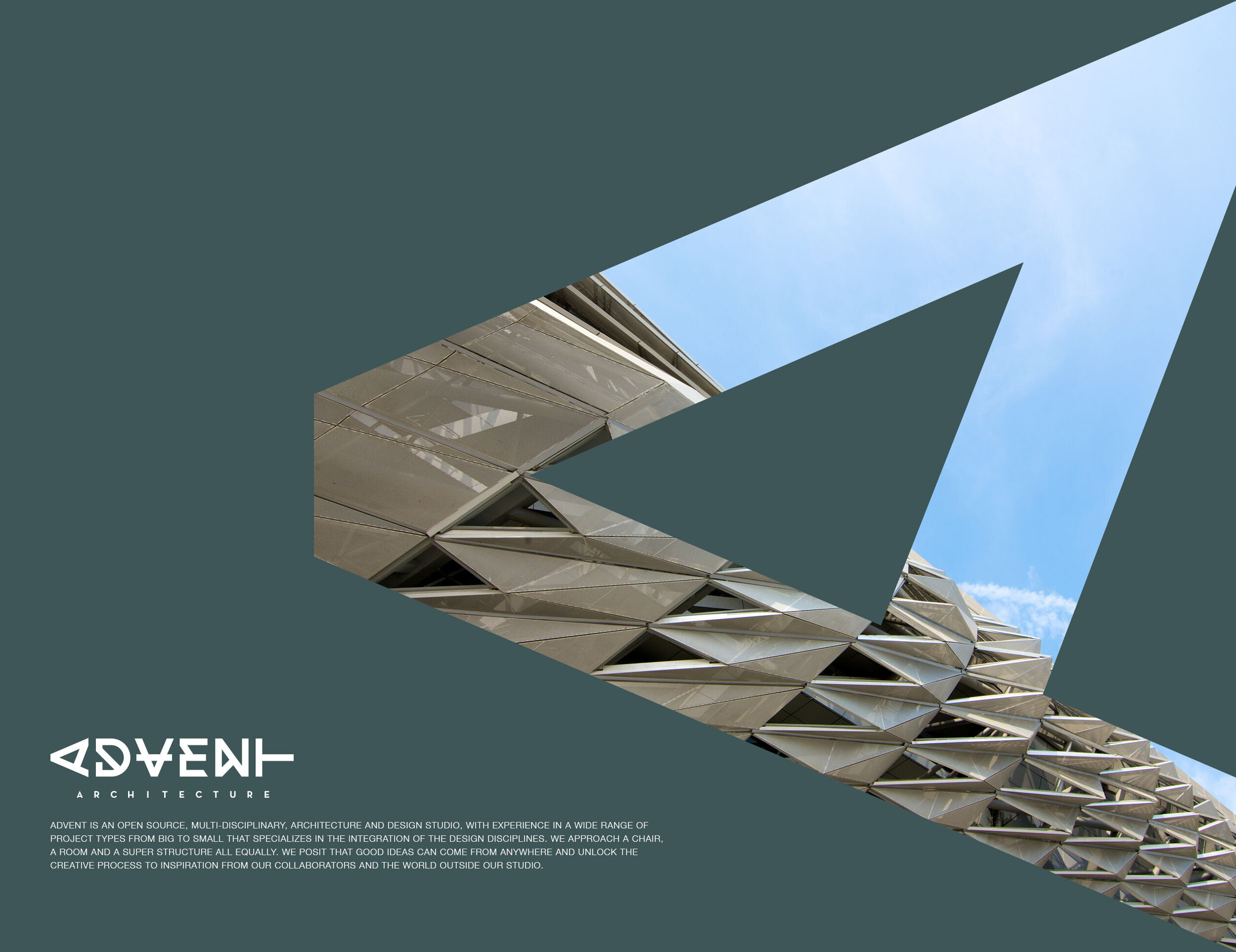
During our deep dive into Advent Architecture’s portfolio, our creative team identified a recurring design motif—triangular forms subtly woven throughout their past and present projects. These shapes, both structurally significant and visually striking, provided a strong foundation for the brand’s identity.
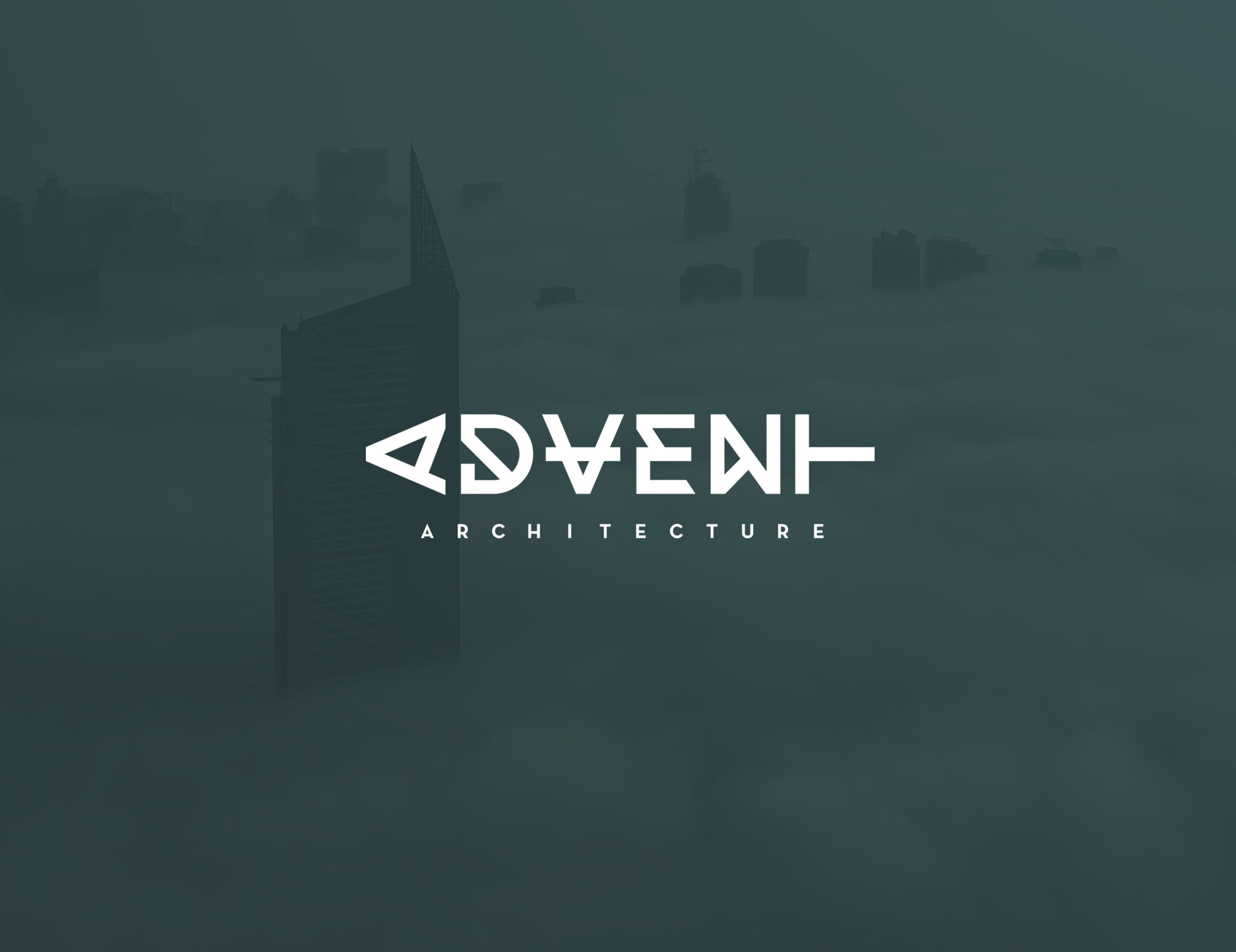
Triangles, in architectural design, symbolize strength, balance, and precision—values that resonated with Advent Architecture’s approach to sustainable building. This discovery led us to develop a brand system centered around a triangular visual language, reinforcing the firm’s unique design philosophy.

Design Execution
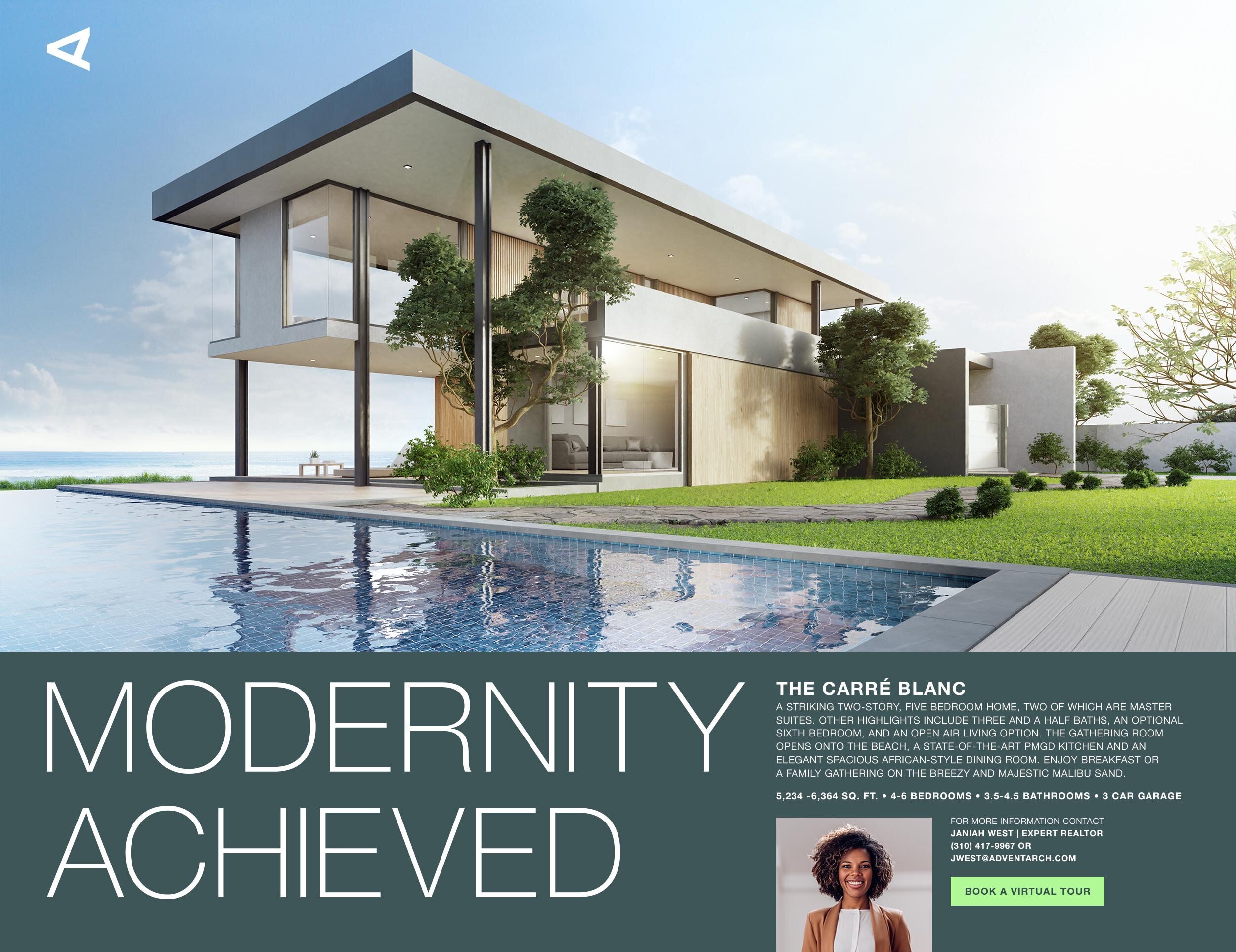
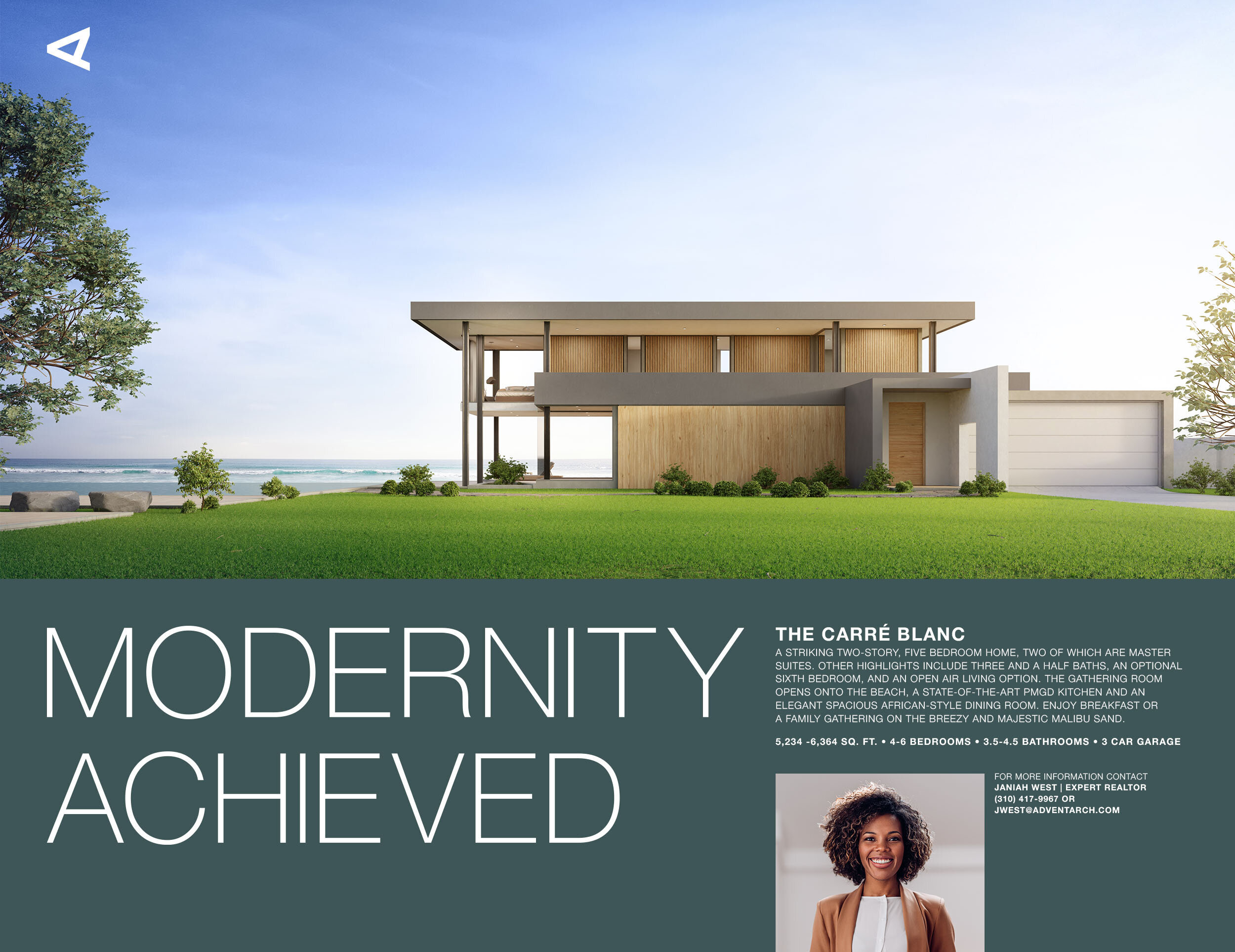
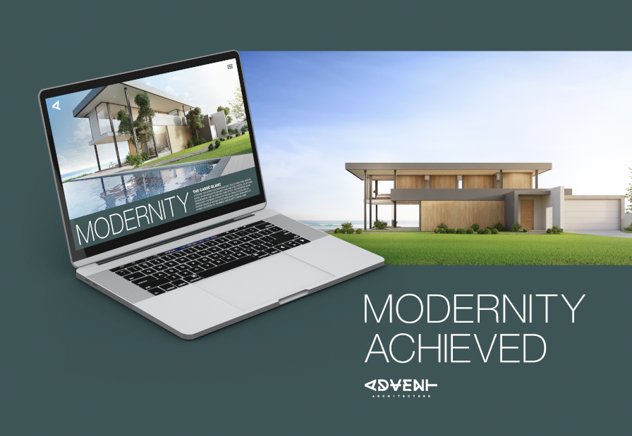
With this concept in place, we built a cohesive and adaptable brand identity that:
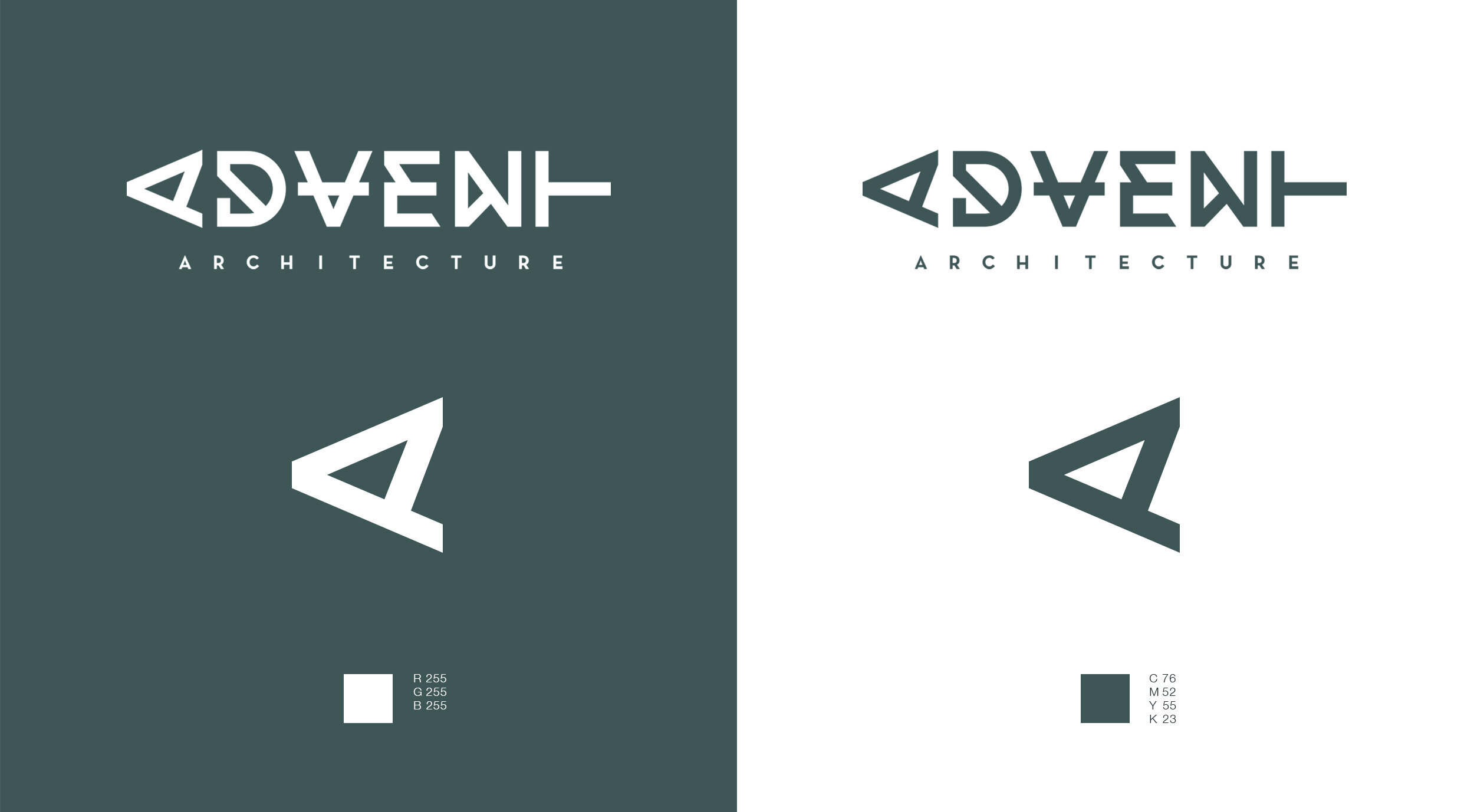
Leverages a strong triangular motif, inspired by the firm’s architectural blueprints.
Maintains a clean, minimal aesthetic, ensuring a modern and professional presence.
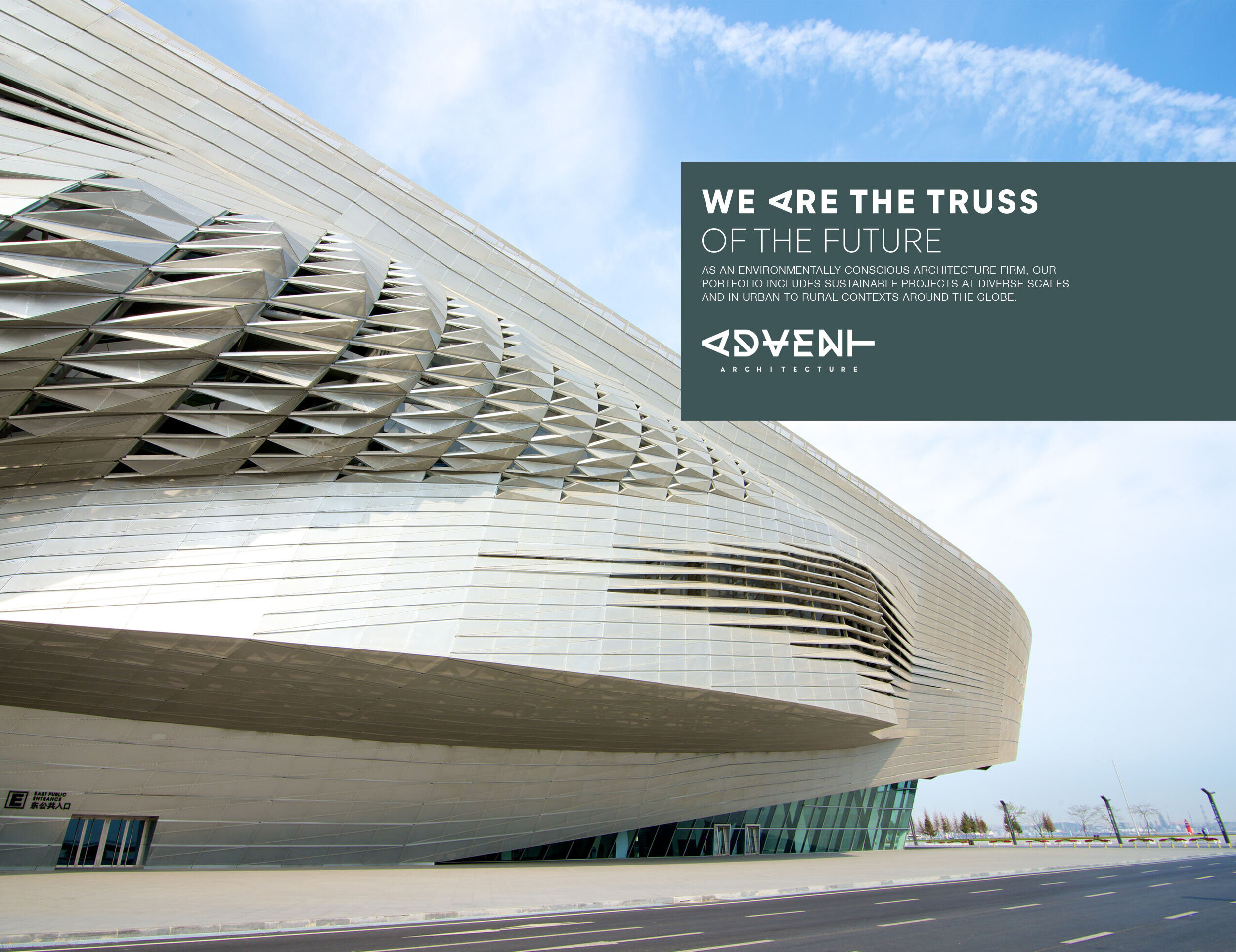
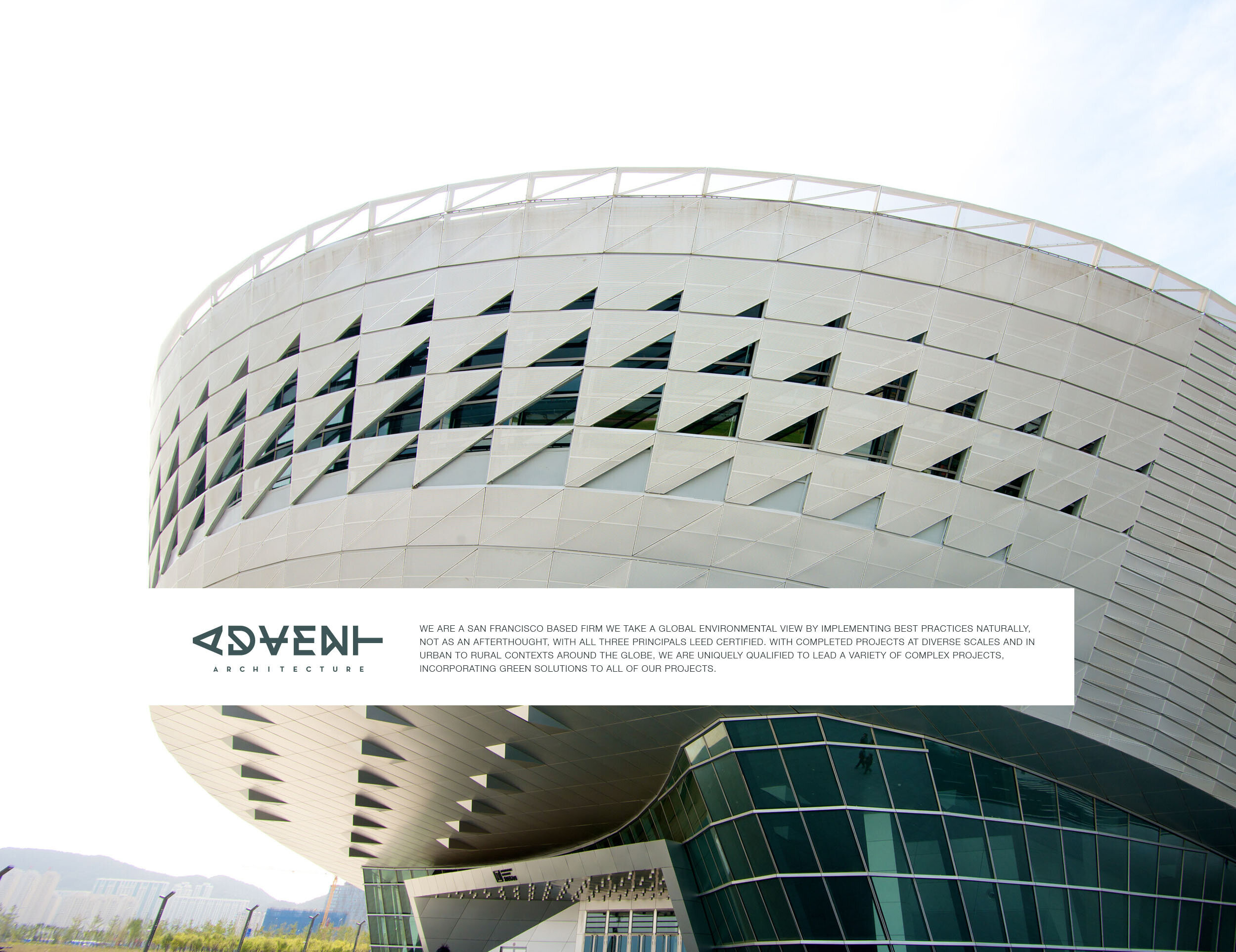
Balances boldness and simplicity, allowing the identity to work seamlessly across digital and physical applications.
Final Outcome
The resulting brand identity is a refined, distinctive visual system that reflects Advent Architecture’s expertise, sustainability-driven mission, and architectural precision. The bold, triangular theme sets the firm apart while maintaining a timeless and sophisticated appeal.
